
No Rub Club
Anti-friction nipple tape for runners, riders and anybody who sweats through their kit. The shop was a stock theme in grey, nothing like the brand on their packaging and socials. We redesigned it as a proper race-day shop built from their own photography, with Apple Pay right on the product page.
Client
- Name
- No Rub Club
- Industry
- Anti-Friction Tape for Athletes
- Location
- South Yorkshire
- Website
- Visit live site →
The challenge.
The brand is near black and hi-vis lime, shot out on the moors. None of that had made it onto the shop.
Apple Pay was switched on, but it only appeared at the very end of checkout, so somebody on an iPhone had to get through the whole basket first.
A small range has to explain the problem, prove the fix and take the money, in one scroll on a phone.
Every word on the shop had to stay theirs.
Our approach.
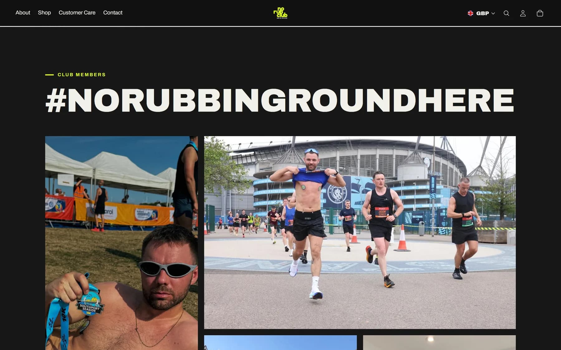
Designed from their own material: the packaging, the launch socials and the moorland shoots, in near black and lime with their tiled logo pattern.
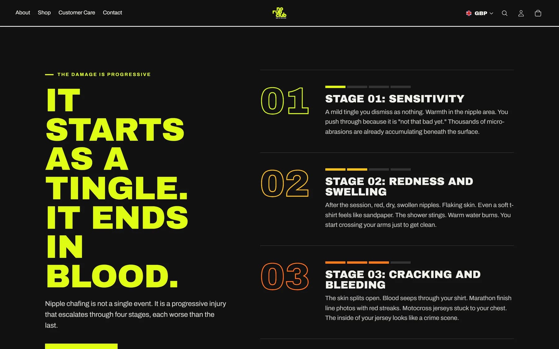
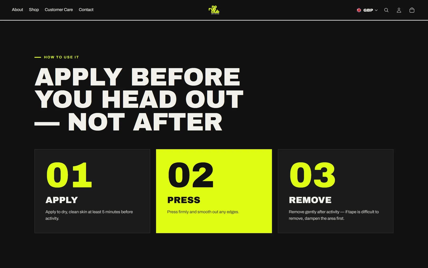
Custom sections built into the theme: the hero, product cards with their own add to cart, the stages of chafing, how to use it, the club members wall and the questions people ask.
Apple Pay, Google Pay and Shop Pay on the product page and in the basket, a sticky add to cart, and a basket that slides open the moment something goes in.
A free delivery bar that counts down to £50, and delivery questions answered from the store's real shipping rates.
Their words, word for word, from the old shop and the customer care page.
Built on an unpublished copy and checked at five screen sizes before it went live, with the old theme kept as a one-click rollback.
The work.
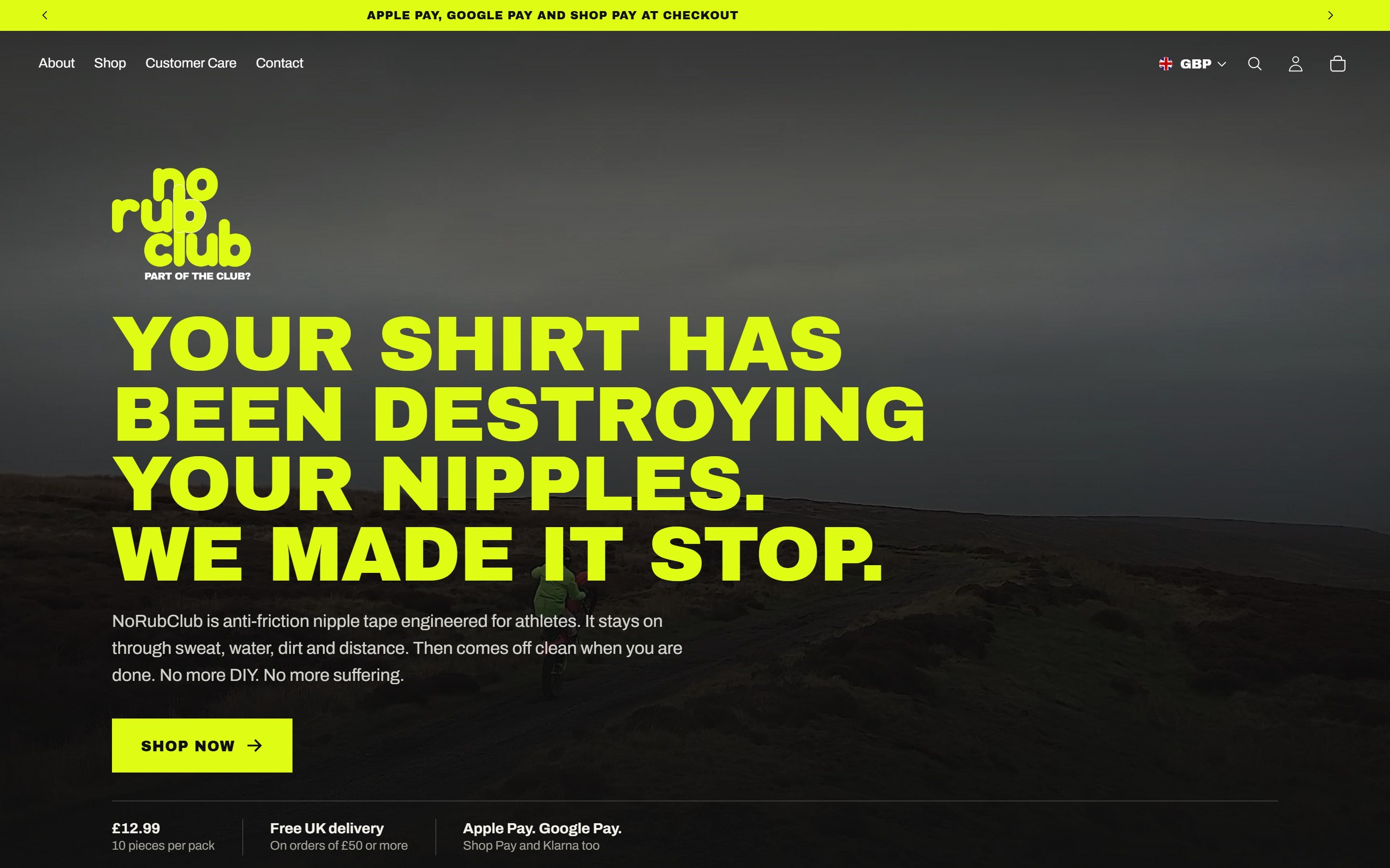
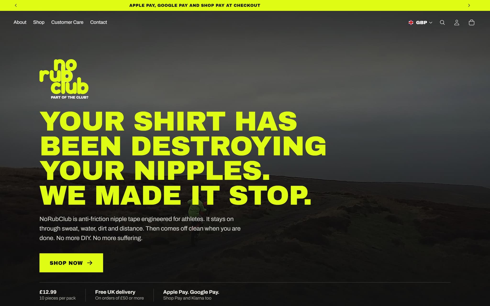
Scroll inside the window to explore, or open the live site.
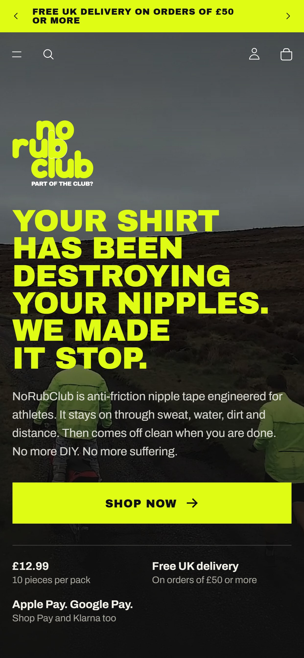
Scroll inside the phone to explore the mobile layout.
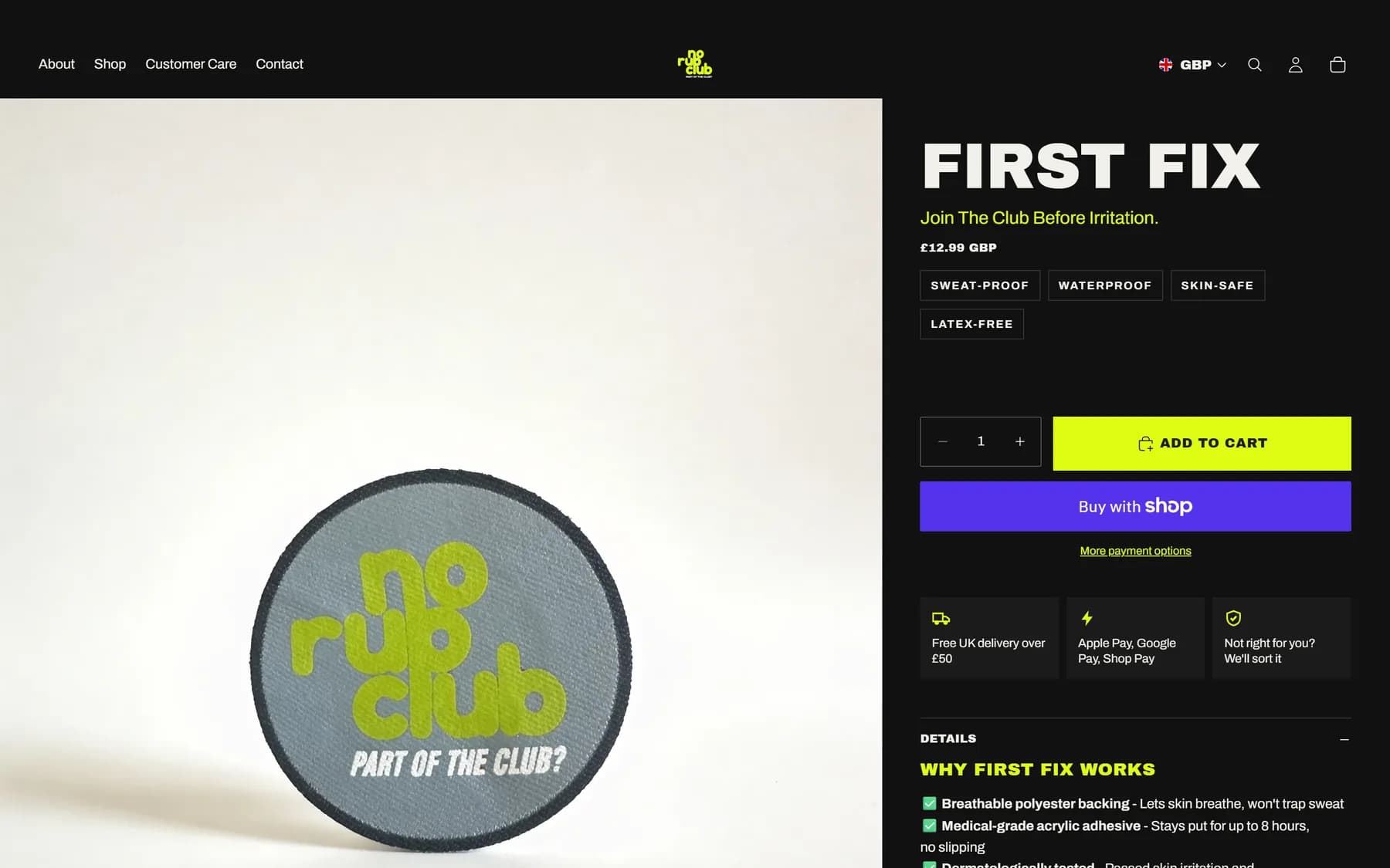
Straight tothe checkout.
Express checkout sits right under the add to cart, and the care page answers what people want to know before they buy.
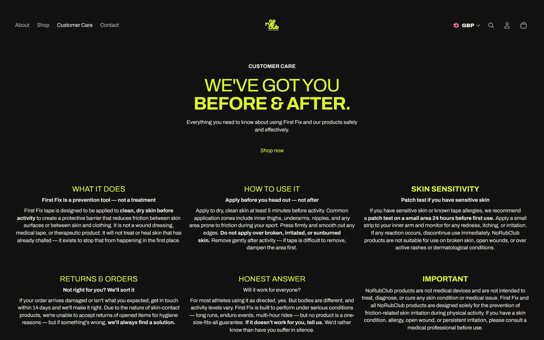
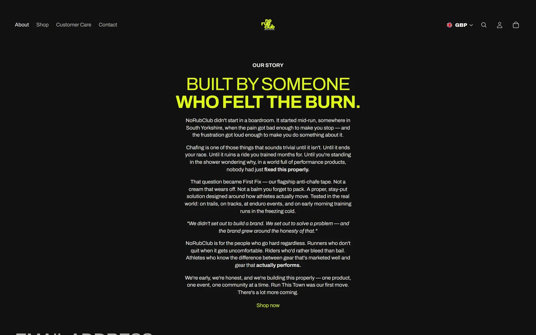
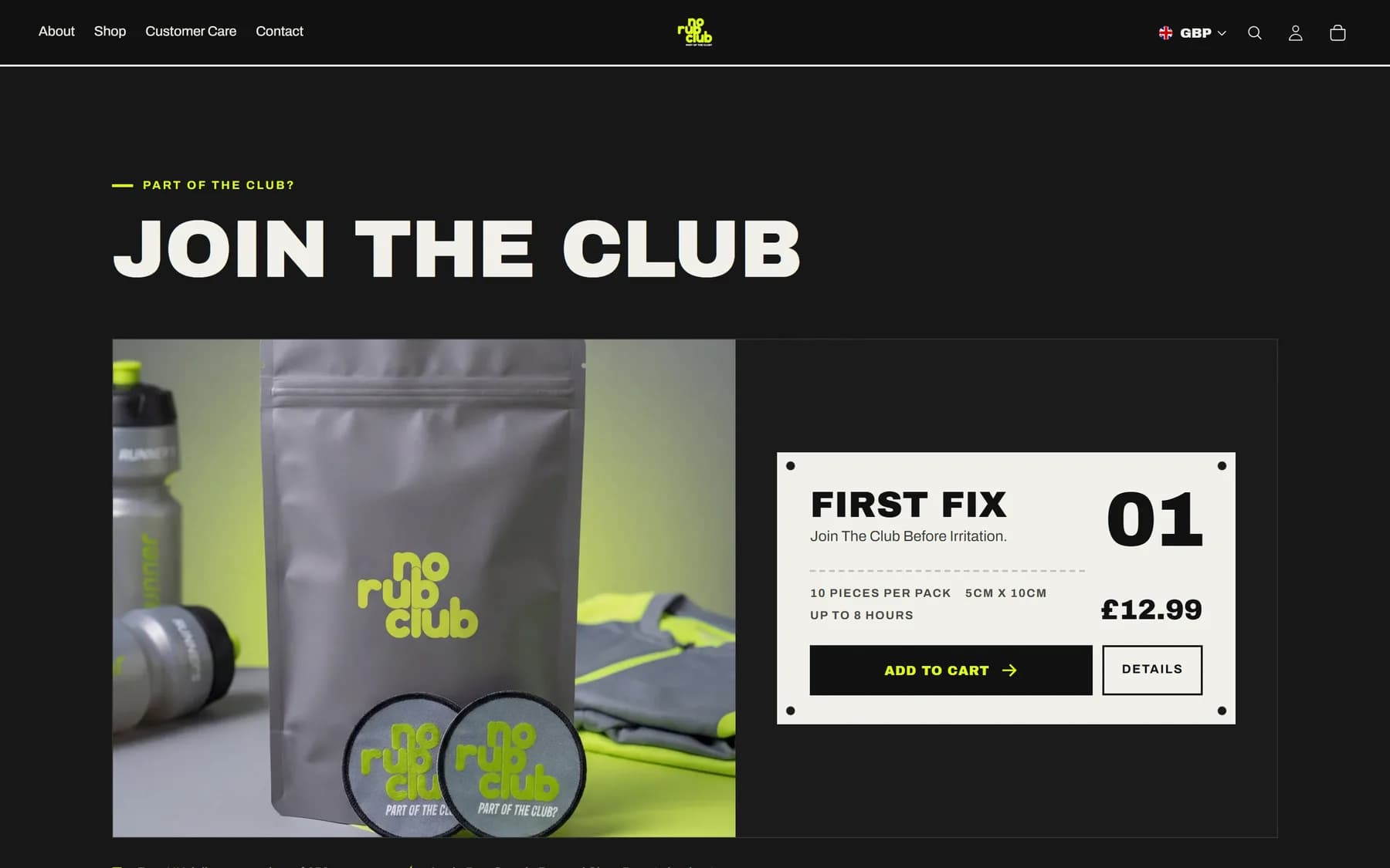
Their brand,finally on the shop.
Near black, hi-vis lime and their own photography. The problem, the fix and the people who use it, in one scroll.
What we built.
- Custom Shopify theme sections
- Apple Pay, Google Pay and Shop Pay on the product page and basket
- Sticky add to cart and an auto-opening basket
- Free delivery progress bar
- Shop now above the fold on every common screen size
- Product layout that adapts as the range grows
- Old theme kept as a one-click rollback
More projects.
Harcon Solutions
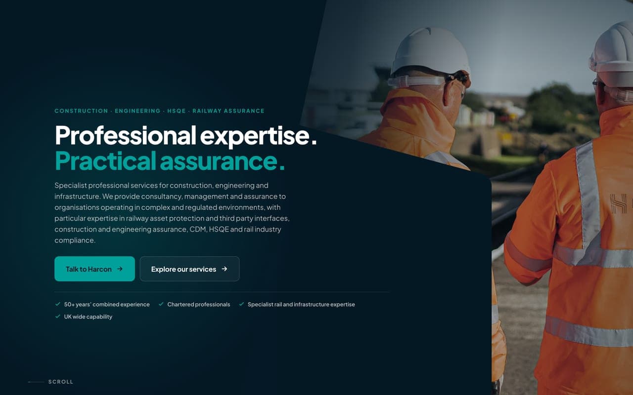
Harcon Solutions are a specialist consultancy for construction, engineering and the railway, trading since 2017 with over 50 years of combined experience between them. Their old WordPress site looked the part but made people work to get in touch. We rebuilt it from scratch on their own look: 24 pages, Railway Asset Protection first, an enquiry form on every service page, and every old link still landing in the right place.
SBS Building & Damp Proofing
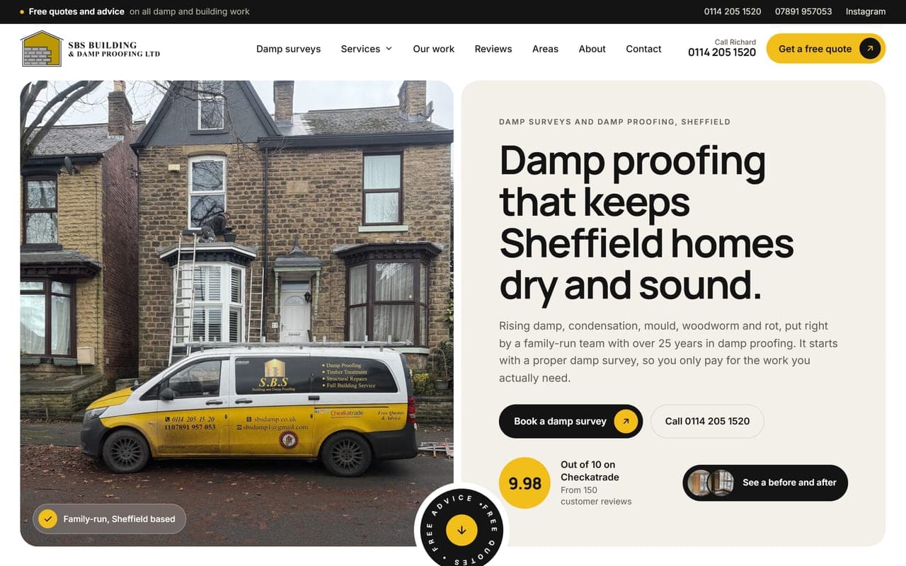
Richard Wright runs a family damp proofing and building firm in Sheffield, with over 25 years in damp proofing and 9.98 out of 10 on Checkatrade from 150 reviews. The old website stopped scrolling halfway down the page, so most visitors never reached the phone number. We rebuilt it from scratch: fifteen pages, damp surveys first, their own photos and their customers' own words.
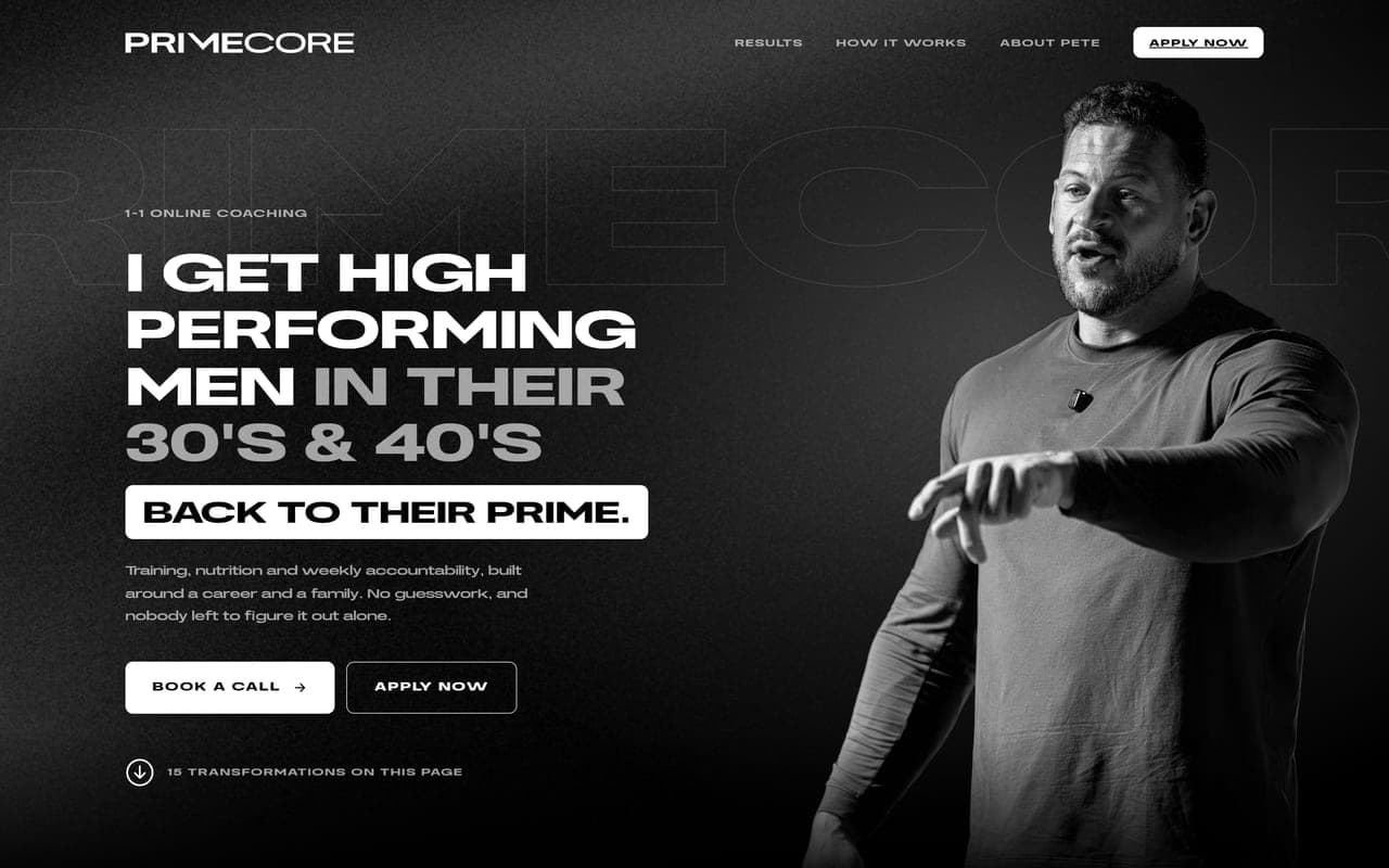
PrimeCore Coaching
Pete Aspinall coaches men in their 30s and 40s online, after a professional rugby league career. We'd already done the PrimeCore rebrand and the weekly carousels. The Instagram was working, but the people it sent had nowhere to land except a booking link. We built one page to catch them: who it's for, the proof, how it works, then a call or an application.
Like whatyou see?
Let's build something like this for your business.
See our 314 reviews on Trustpilot