
Redefining Shakti
Logo design plus a bespoke landing page for a women's wellness brand. Soft, considered, and confidently feminine without leaning generic.
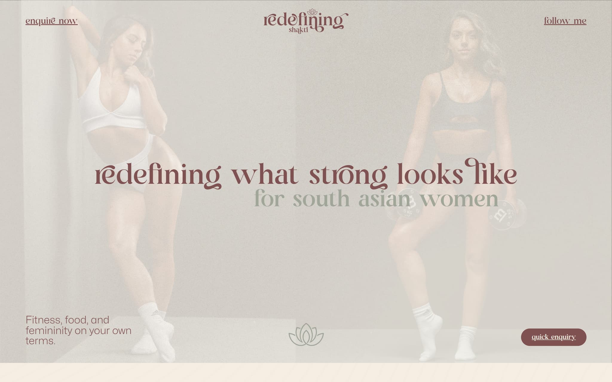
Client
- Name
- Redefining Shakti
- Industry
- Women's Wellness
- Location
- UK
- Website
- Visit live site →
The challenge.
Wellness space is saturated with the same visual cues: soft pinks, hand-lettered scripts, generic mandalas. They wanted to feel different.
Brand needed to read sophisticated and ceremonial without becoming inaccessible.
Single offer, single page. The full story had to land in one scroll.
Our approach.
Logo first: a refined mark that respects the Shakti reference without resorting to cliché.
Landing page built around the logo's visual language. Considered typography, warm palette, generous spacing.
Narrative copy structure: invitation, philosophy, what's inside, who it's for, how to join.
The work.
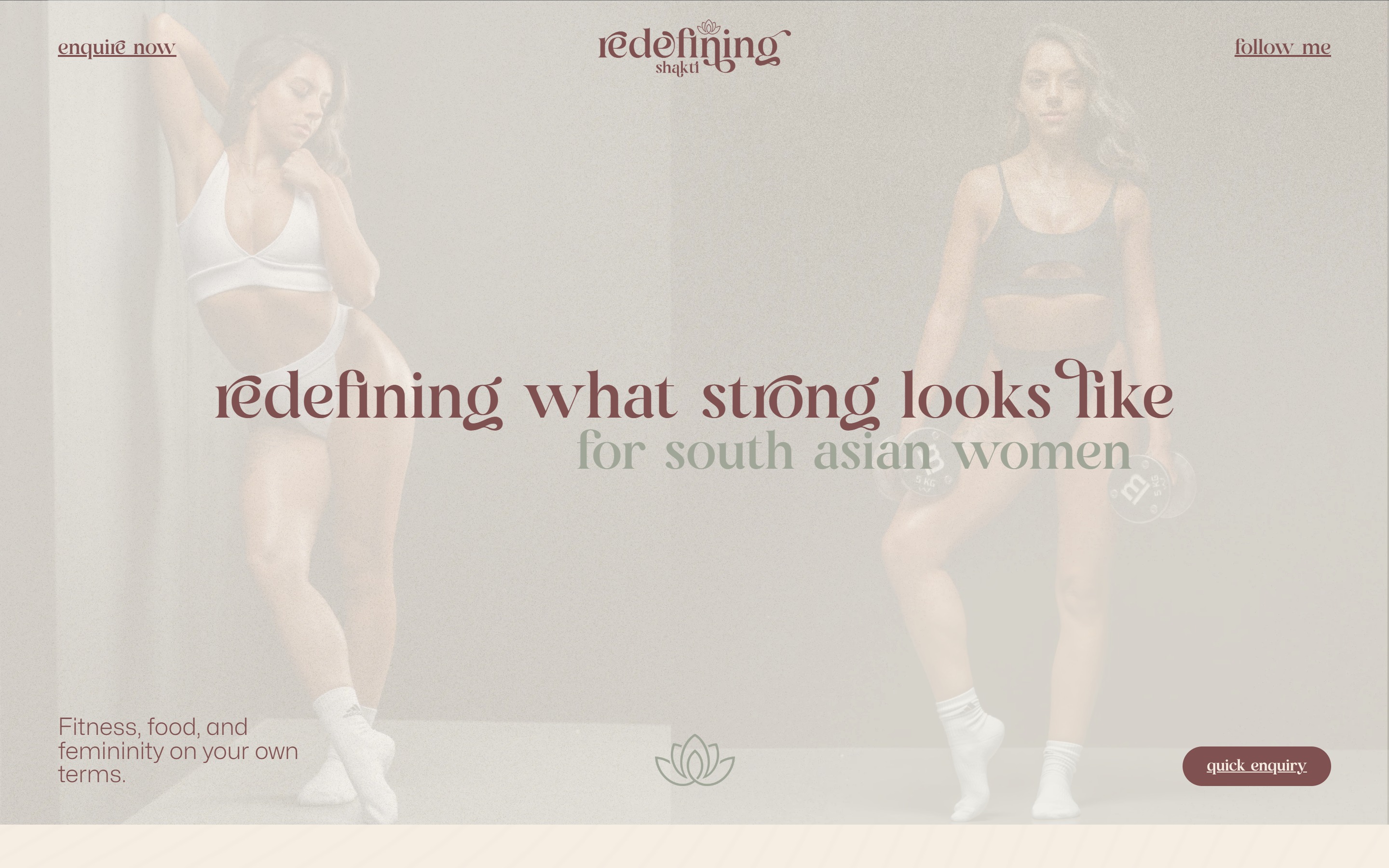
Scroll inside the window to explore, or open the live site.
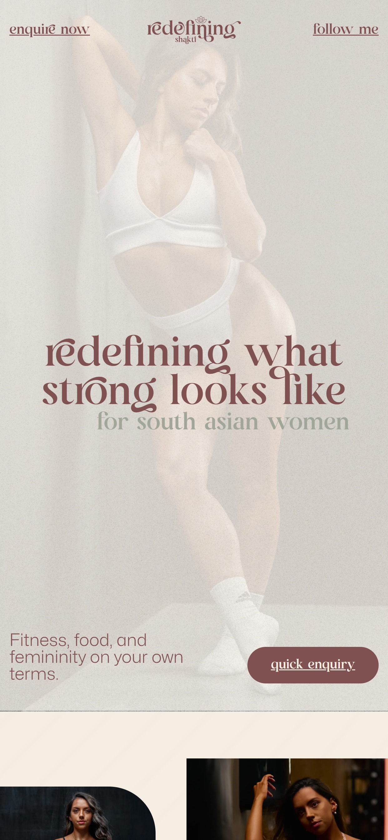
Scroll inside the phone to explore the mobile layout.
What we built.
- Logo + brand mark design
- Bespoke landing page build
- Considered typography + palette
- Single-offer narrative structure
- Mobile-first responsive
- Booking + enquiry integration
The absolute best experience from start to finish. Could not be happier with the outcome of working with Alex and Paul. From the first initial call, Alex has taken the vision of the brand I wanted to build and helped bring it to life. Alongside the logo design, the AW Media team have built my website and helped out with my socials. Super professional, reliable and easy to work with, will never work with another designer again. It turned out even better than I could've imagined.
Redefining Shakti
Women's Wellness
More projects.
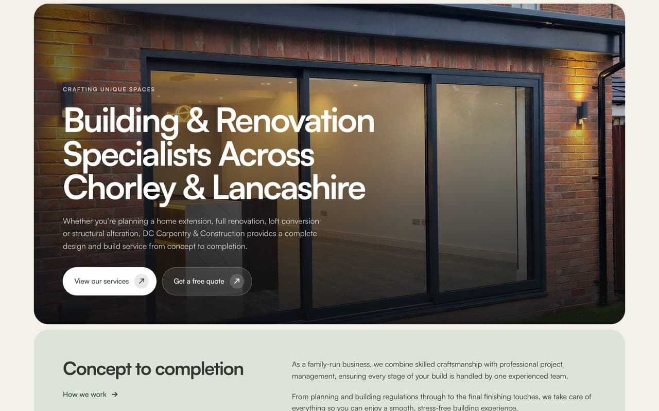
DC Carpentry & Construction
DC Carpentry & Construction are a family-run building company in Chorley, run by Natasha and Dale: extensions, structural work, kitchens and bespoke carpentry across Lancashire. Their old website had gone live before it was finished. We rebuilt it from scratch around Natasha's own words: 40 pages, their projects told stage by stage in their own photos, a page for each of the 20 towns they work in, and a quote form that finally goes somewhere.
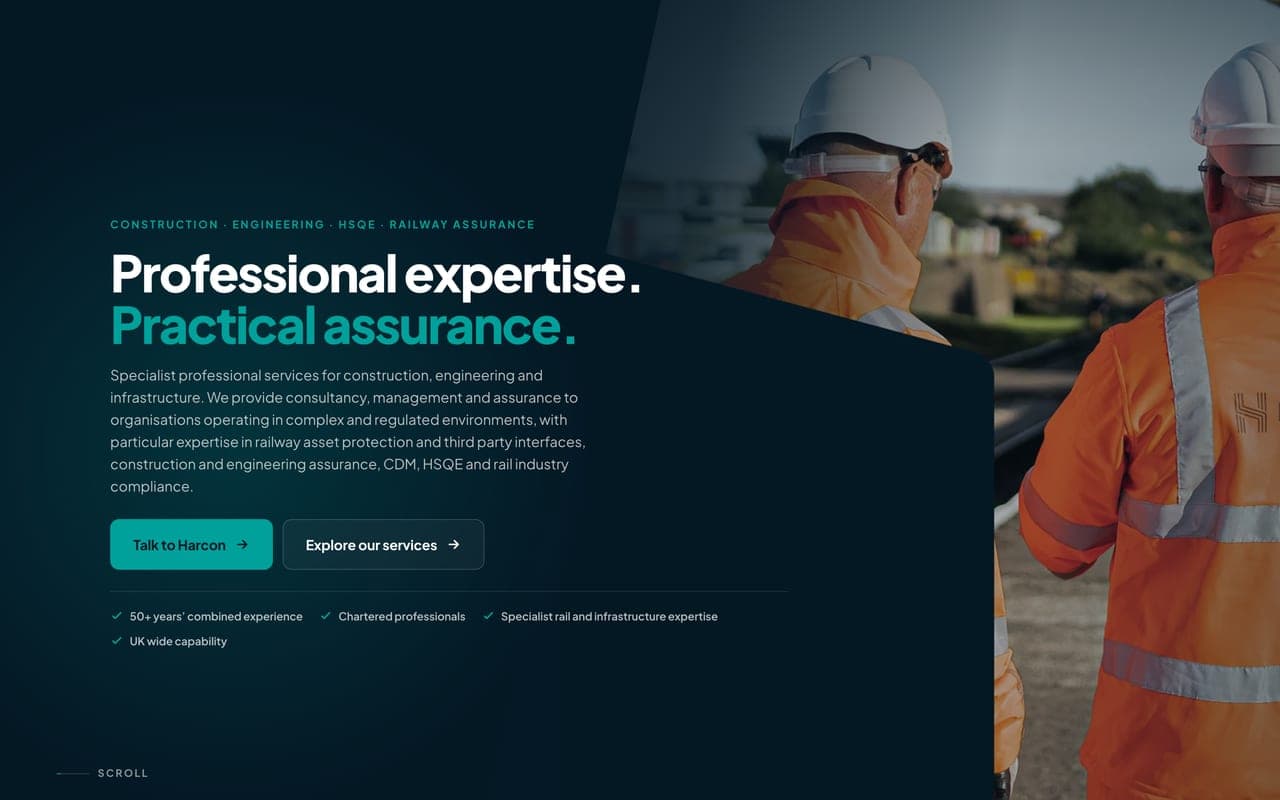
Harcon Solutions
Harcon Solutions are a specialist consultancy for construction, engineering and the railway, trading since 2017 with over 50 years of combined experience between them. Their old WordPress site looked the part but made people work to get in touch. We rebuilt it from scratch on their own look: 24 pages, Railway Asset Protection first, an enquiry form on every service page, and every old link still landing in the right place.
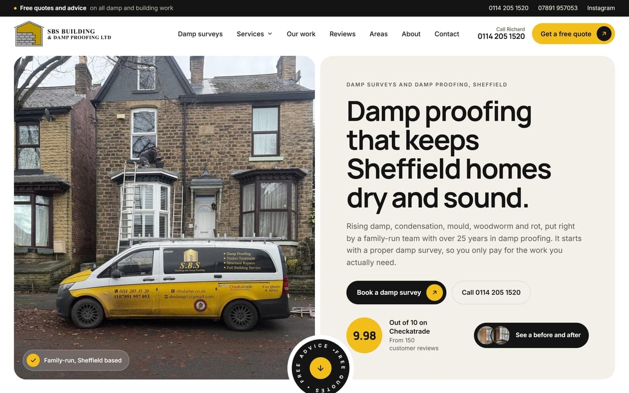
SBS Building & Damp Proofing
Richard Wright runs a family damp proofing and building firm in Sheffield, with over 25 years in damp proofing and 9.98 out of 10 on Checkatrade from 150 reviews. The old website stopped scrolling halfway down the page, so most visitors never reached the phone number. We rebuilt it from scratch: fifteen pages, damp surveys first, their own photos and their customers' own words.
Like whatyou see?
Let's build something like this for your business.
See our 314 reviews on Trustpilot